Crimson AI - Surgical Cost
Detailed Case Study

The detailed work
You've seen the overview. This page goes deeper into three pieces of work that show how I approached the project: the Preference Card Optimizer, the Supply Bid Upload, and a Summary Dashboard redesign. A few additional pieces follow.
Preference Card Optimizer
1.1 Restructuring how users find a card
Problem:
The groundwork I inherited had no direct way to search for a preference card.
To find one, users had to enter through Search Supply (which surfaced cards as a side effect of looking for an item), or through Card Maintenance > New Cards Added (a maintenance frame that defaulted to the last 3 months). Both the paths were indirect and hidden among features.
Old taskflow of searching card
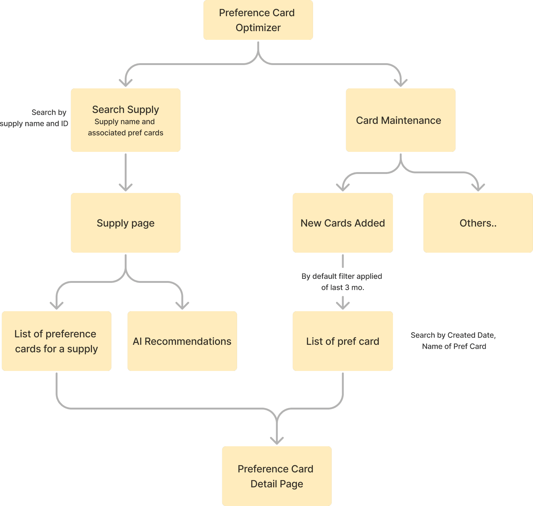
Search is the entry point to every downstream action in the module. If users can't find the right card on their terms, nothing else matters.
Observation & Idea:
I restructured the IA around three clear intents:
Search Preference Card: when the user wants to look up a card directly. Splits into:
Search by card
when the user is finding a card directly by its paramaters.
Filters: Card name, ID, procedure, surgeon, facility, unit, creation date, updated date, card cost.
Search by supply
when the user is investigating a specific item. Returns all cards that contain it.
Filters: Supply name, ID, vendor, manufacturer, price, implant status, contract status
Card Analysis Themes: when the user wants to investigate cards by problem type. Defaulted to recently created cards within the last 3 months, but the filter is now user-configurable.
A direct path to the Preference Card Detail Page from every entry point, so the user lands on the same destination regardless of how they got there.
Search & Refine Enhancement:
The user now gets a streamlined path to find a card. Search filters expanded from 2 (name, created date) to a structured set across both card and supply dimensions, based on how CVMs described nurse managers' actual search behavior in client calls.

New Taskflow
Old Taskflow
Clickpath Comparison
The user now answers one of three clear questions. Search filters expanded from 2 (name, created date) to a structured set across both card and supply dimensions, based on how CVMs described nurse managers' actual search behavior in client calls.
Preference Card Optimizer
1.2 Card Analysis Themes
Context
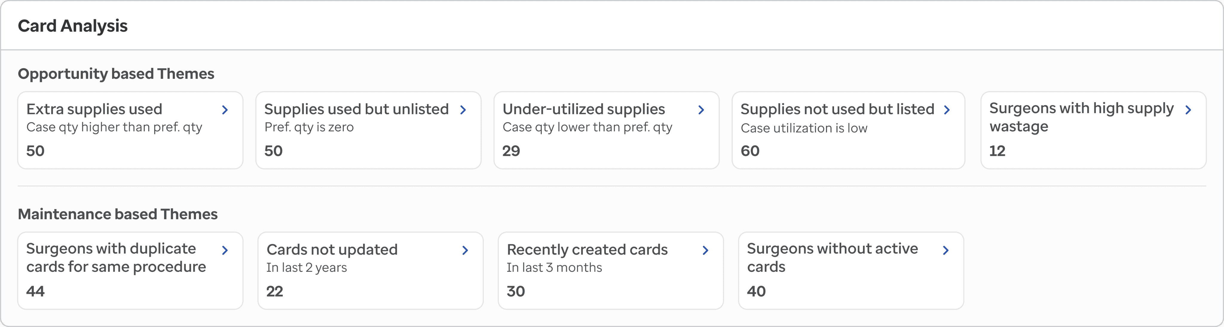
Card Analysis is the section that tells a nurse manager where to look first. It groups preference cards into themes based on the problem each card has: supplies being overused, items sitting on cards but never used, cards that haven't been touched in years, surgeons performing cases without an active card.

Present dashboard screenshot
Each theme answers a different question.
"Where am I losing money?"
"Which cards are out of date?"
"Where are the maintenance gaps?"
What was missing in the old design
When I picked this up, it was called Card Maintenance. Four themes on the dashboard, each linking to a detail page that listed flagged cards. The detail page was there, but it was confused about its own job.
The threshold parameters were treated like search fields.
The top of the old detail page had four inputs: Search by Card, Procedure, Supply Cost, Supply Utilization%. They looked like filters. But two of them (Supply Cost and Utilization%) were actually defining what the theme meant. Change them, and the entire list of flagged cards changes, not just the visible subset.
That's two different kind of control:
Flagging Thresholds are the default values with which the flagged count comes up on the screen
Filters narrow what you see in the flagged results
I separated the two.
I introduced an Analyze accordion at the top, holding the threshold criteria as chips: "Used in More Than: 80% Cases," "Supply Cost Above: $150," "Min. Case Count: 10," "Case Timeframe: Last 3 mo." A settings flyout opens for editing them. Save, apply, and the dashboard count recalculates.
Below it, a separate Search & Refine accordion holds the table filters for narrowing down what you see inside the flagged list.
The user now has a clear mental model:
Some themes needed two POVs
There can be different POVs for different themes like:
A nurse manager investigating waste asks "which supplies?"
A nurse manager prepping a surgeon conversation asks "which cards?" Same data, different question.
The old design had tabs labeled Preference Cards / Supply, which named the data type but not the user's intent. I renamed them to Card View and Supply View, and made the default view theme-aware (a "Supplies Used but Unlisted" theme opens on Supply View, because that's the natural entry point for that question).
Usability Testing changed the themes count, names & layout
Two rounds with Client Value Managers added three themes I hadn't designed for:
Qty of supply in written in preference card is higher than actual usage,
Qty of supply in written in preference card is ower than actual usage
Surgeons performing cases without active cards.
Six themes became nine.
Leadership wanted all nine themes visible upfront. Their concern was fair: in a workflow this consequential, a hidden theme is a missed theme.
So I sub-grouped instead based on their feedback:
Opportunity-based (overuse, underuse, substitution)
Maintenance-based (duplicates, outdated, governance gaps).
I had to switch to 5column grid, tighter cards, smaller text, two clear subgroup headers.
But the real issue wasn't just visibility of Analyze Criteria. It was also subjectivity.
"High cost" is not a fixed number. At one hospital it's $100. At another, the same nurse manager might want to look at supplies above $1,000. "Used in more than X% of cases" shifts based on procedure mix. A national default doesn't fit any single hospital perfectly.
The fix: a Change Default Settings flyout, accessible from the Analyze accordion.
Users can edit each threshold and save the values as their own personal defaults.

Layout could not support more than 4 themes
Table filters were merged with flagging thresholds criteria
Saved Settings, where users can come back to view or revert their saved configuration
3 themes added based on UT Round 1
Renaming based on UT round 2
Layout change based on Leadership feedback
A helper line at the top makes the consequence clear
Old screen clickpath
Preference Card Optimizer
Turning raw early-stage design into a shippable optimizer for 300+ surgical preference cards per hospital.
Nurse managers maintain hundreds of preference cards: the list of supplies each surgeon prefers per procedure. When cards go stale, the OR over-pulls (waste) or under-pulls (delays, last minute rush & impact on surgery efficacy). Nearly 27% of surgical supplies go unused, much of it traced back to outdated cards.

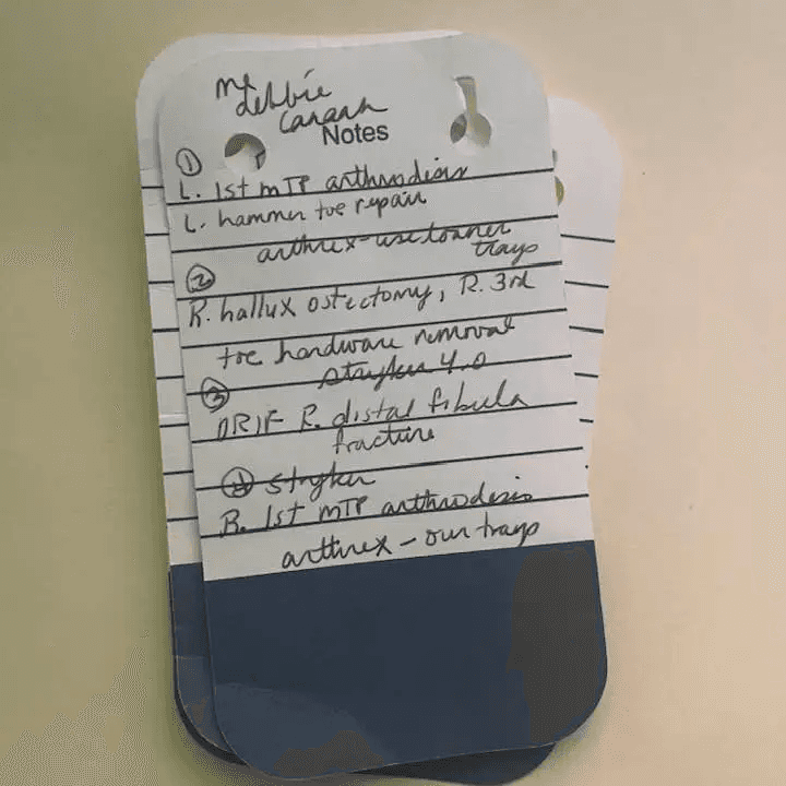
Traditionally, preference cards were paper-based, but they have gradually moved to electronic medical records (EMR) for easier access and updates.
Preference Card Optimizer was not a part of a legacy feature and this was the old screen, made by previous team:

When I joined in February 2025, the previous team had laid early groundwork.
But due to tight timelines for client demos, the IA was non-intuitive, the layout were bulky because of out-dated design system, and the workflows were inconsistent.
The feature needed to be re-thought before it could ship.
Content
End to End Feature: Preference Card Optimizer
Feature I Recently worked on: Manage Measures
Design Operations:
Dev handoff files
Front-End Audit & QA
Other works:
Surgical Cost Summary Dashboard
Procedure Cost Manager landing page redesign.
Crimson AI Design Consistency
Impact & Reflections

Project overview
Team
Business Leaders + PM + Designer + TPM + Developers + Data Methodologists + Client Value Managers (CVMs)
Duration
Joined in Feb 2025 - Ongoing
Platform
Web-Application
Part of Crimson AI suite
Goal
Design a web app that helps US hospitals save money on surgeries by turning complex supply and cost data into clear, actionable insights for surgical supplies.
Product Manager
UX Design Team
Tech. Product Manager
Engineers
Client Value Managers
Data Methodologists
Business Leaders
UX Designer
Development phase
Creation Phase
Design Consistency Phase
Discovery + Validation Phase
this is me


New screen clickpath
Clicking on supply or pref card name opens up its details on a popup
The card and supply ID comes below the name as it is also as important as name of them
Introduced pattern of always showing number of total and filtered results on the screen.
Changed the placement of components, layout, and searching feature on the page, as the list can be long.
Usability testing feedback:
Usability testing with a Client Value Manager validated the restructured search.
"Searching a preference card directly, via multiple criteria like procedure and surgeons in the Search and Refine accordion will be very helpful for the users."
‒ Client Value Manager, Usability Testing Round 1
Usability testing feedback:
Usability testing with a Client Value Manager validated this flexibility.
"Parameters like 'under-utilized' mean different things to each client, so being able to adjust this is great."
‒ Client Value Manager, UT Round 1


Search & Refine = Table filters
narrow what you see in the flagged results
Analyze = Flagging Thresholds
are the default values with which the flagged count comes up on the screen


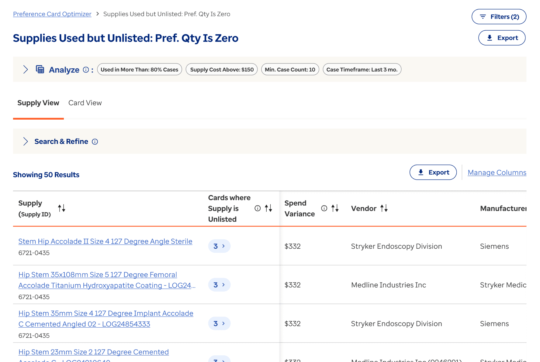
Old screens
New screens




Preference Card Optimizer
1.3 AI Smart Opportunities
Problem
A single facility can have 100+ preference cards, each with 20+ supplies on it. That's thousands of line items a nurse manager is expected to keep accurate, current, and aligned with how cases are actually being run.
They face these pain-points in their job:
Cards drift out of date as procedures evolve and new supplies come in
Surgeons resist quantity changes without evidence
Manual review is slow, error-prone, and rarely catches everything
The cost of not keeping cards current shows up downstream as waste, last-minute OR scrambles, and missed savings

AI identifies opportunities where attention is required
This is where AI earns its keep. Our Smart Opportunities feature looks across every card and surfaces the changes that actually matter: supplies with viable cheaper substitutes, quantities that don't match real case usage, items that haven't been used in a year but still sit on the card.
Concept
The concept came from my PM. The recommendation logic was shaped and validated by the data team. My job was to turn it into an experience: where it lives in the IA, how users encounter it, and how they make decisions with it.
I designed it to live at two levels, because nurse managers approach these recommendations from two different starting points.
Preference Card Optimizer
Usability Testing
I conducted two rounds of Usability Evaluation with a client value manager in July and August of 2025.
Testing Format:
1:1 moderated task based usability testing
Focus Areas:
Navigation and task completion, Terminology clarity, Visual cues and feedback
Preparing tasks for the users
Created Tasks for the user to perform on the UI where we can identify areas user faces any challenges.
While creating these tasks, we focused on end-to-end flows of three theme cards.
Conducting testing session
During the testing we made sure to keep our agenda clear, precise and staying neutral throughout testing to avoid biases for the user.
Avoided providing justifications for the design decisions for collecting user thoughts.
Prepared running notes during the testing around the observations made for all kinds of assumptions and challenges used faced.
Synthesis & Documentation
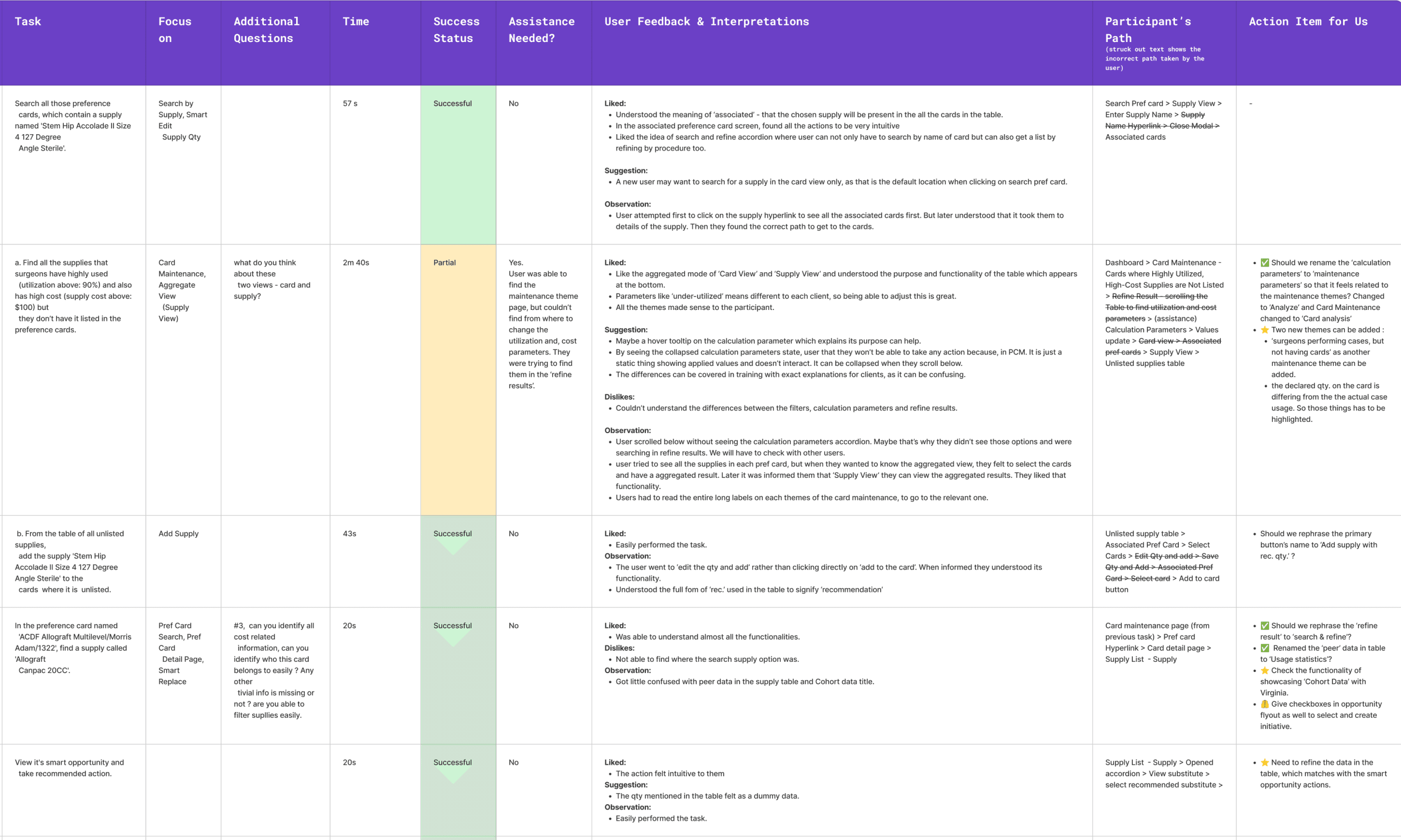
I used the following table to synthesize insights and action items for design level changes.
UT session 1
Got feedback to add two more themes under Card Analysis for having better context around the scenarios.
User liked the ‘supply view’ and ‘card view’ separation
Rename ‘calculation parameter’ to ‘Analysis criteria’, and add tooltip to explain what it does
UT session 2
User found the navigation intuitive, once they were bale to come inside the right theme.
Got feedback that better renaming of theme cards will help in identifying items easily. Like under-utilized preference supply can be changed to Case quantity is lower than what is documented on card.
the terms like ‘cards without supply’ can be misleading, as it can mean data is being pulled out from other cards of same procedure too. It is better to add a tooltip to explain it.
Preference Card Optimizer
What shipped in the Preference Card Optimizer
A new module designed end to end, built across 6+ months of iterative releases with PM, data methodologists, engineering, and Client Value Managers.
03
entry points for finding a card, restructured around user intent
06 → 09
Card Analysis themes, configurable thresholds, dual-perspective views
02
rounds of moderated usability testing with CVMs, shaping both terminology and feature
120+
screens delivered to engineering with edge cases, error states, and interaction specs
04
Core Features Shipped: AI Smart Opportunities, Search Card, Card Analysis, Card Compare
Impact overview of the selected recommendations
I designed an Impact Overview block that sits above the recommendation table. It shows the card's current Total Open Supply Cost and Variance Opportunity, alongside the projected values if the user accepts their current selections.
As the user checks and unchecks recommendations, the projected numbers update in real time.


The projected values shows up based on selection
Impact overview section
User selects some recommendations
Card level Opportunity
Opportunity Summary for the card, pulls every AI-generated recommendation across the card and organizes them into two tabs:
Recommended Substitutes: every supply where AI found a viable alternative, with the top substitute pre-selected

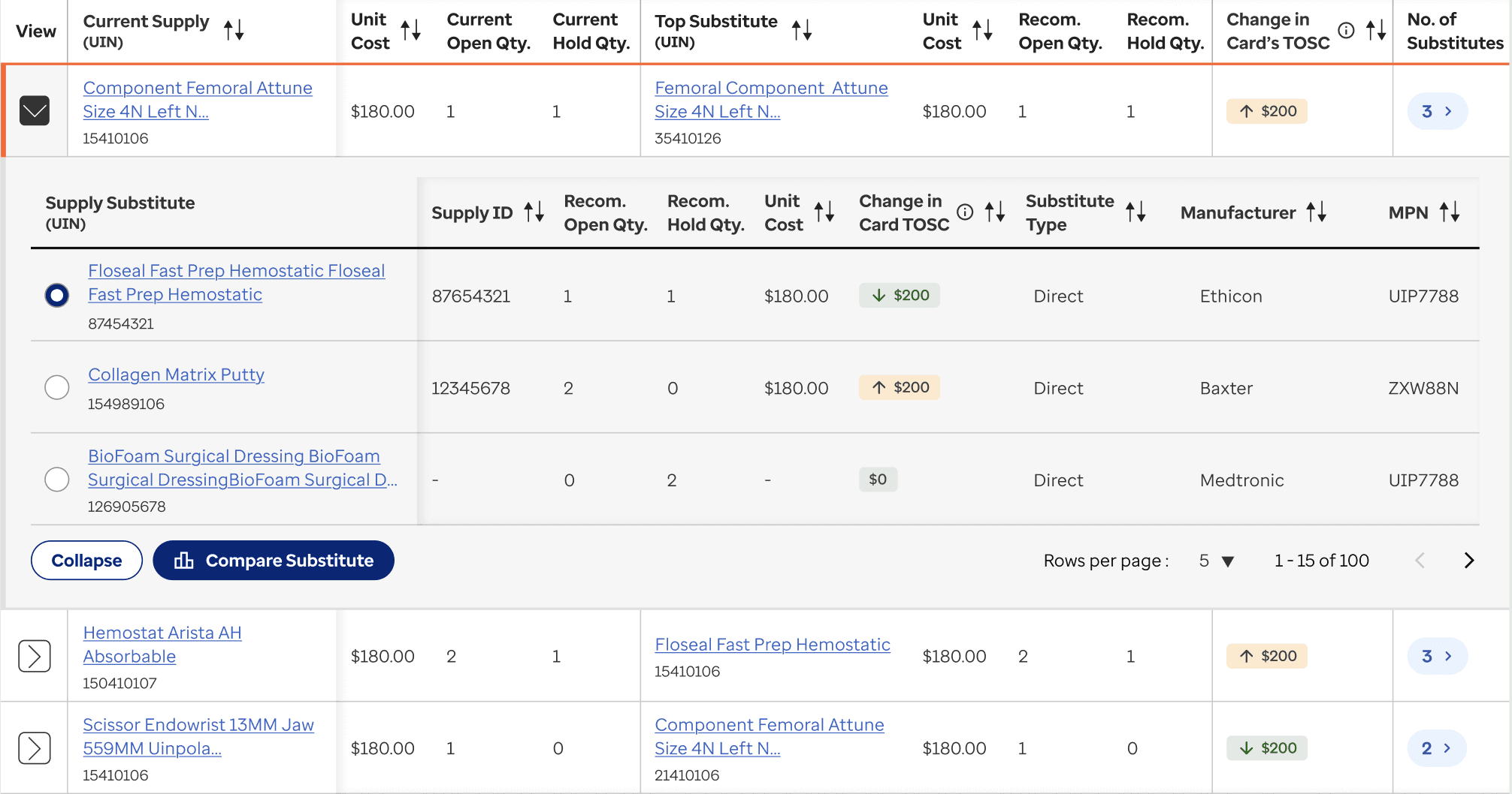
Top substitute is on the parent table
Also tells how many total substitutes are available for the supply.
Collapsed state:
Expanded state:
Recommended Maintenance: every supply where AI thinks the quantity should change, or where the supply itself should be removed or added

Each row also carries the AI's reasoning.
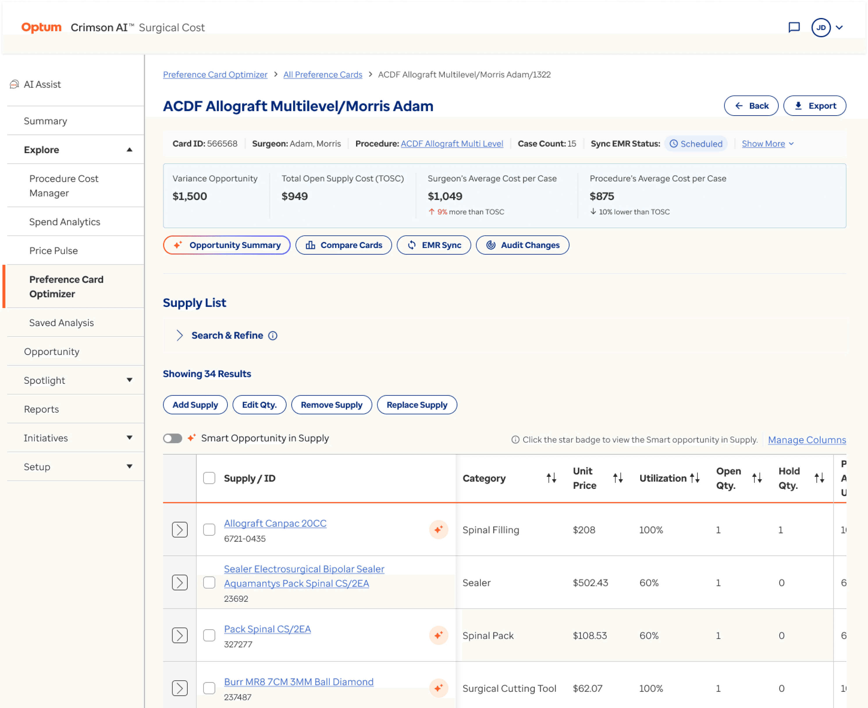
Card level opportunity
Supply level opportunity
Preference Card Detail Page:
Supply level Opportunity
For these, a star icon sits next to each supply in the card's supply list. Clicking it opens a Supply Opportunity drawer with the same two tabs (Substitutes, Maintenance), but scoped to just that one supply.


Preference Card Optimizer
1.4 Compare Preference Cards
Context
A nurse manager standardizing cards across surgeons doing the same procedure needs to see them side by side. The compare feature existed in rough form when I picked it up, but I scaled it to add upto 10 cards at once for easy comparison.

Supply details stay frozen on the left.
Card columns repeat to the right.
I squeezed each card column to the minimum that still kept everything readable, so users see as many cards as possible before scrolling.
The Add Cards to Compare flow
Two tabs for two different mental models:
Recommended Cards for users exploring. AI surfaces cards that share procedure, surgeon, or supply patterns.

Manually Search Cards for users who know exactly what they want, using the same Search & Refine filters.


"The flows and tasks were straightforward and easy to identify, and the instructions on the screen were also pretty understandable and clear. I am pretty excited to show these features to our clients"
‒ Client Value Manager, Discussion on design improvements made post UT Round 2
"We are in a very good shape. These improvements will help clients keep preference cards up-to-date and remove duplicates or obsolete cards."
‒ Advisory Team Member, August 2026
Design Operation Initiatives
Two practices I started building into how our team works. Neither existed in any structured way when I joined, not in Surgical Cost, not in the other Crimson AI modules. I introduced them gradually, and they've made the design-to-build handoff a lot smoother for everyone.
DESIGN OPERATIONS INITIATIVE : 1
Detailed Dev Hand-Off Figma File
How I hand off UI designs to engineering
I structure handoff files around flows, not screens. Each Figma page maps to a user journey, with screens laid out in the order a user actually moves through them. Engineering can read the file the way the product gets used.
Inside each flow, I include everything someone would otherwise have to ask me about:
The happy path, in order
Edge cases (long texts with truncation, zero search results, disabled button states)
Error states (validation, permission, API issues)
Empty and skeleton loading states
Hover tooltips and their content
UX writing checked for grammar, punctuation, and clarity of meaning
[Image: snippet of a handoff Figma file showing flow-based layout with multiple states for one screen]
A detailed handoff file is half the job. The other half happens in the conversation.
So we run refinement calls where the TPM and I walk the dev team through the file, explain the interactions, and answer questions live. Devs write Rally stories and point them right there.
Outside of those calls, Figma comments handle async questions, and Teams chat picks up the small stuff that doesn't need a pin.
DESIGN OPERATIONS INITIATIVE : 2
Frontend Audit
How I perform QA audit
I introduced a detailed frontend audit protocol on the team. Here's what it looks like.
I take a screenshot of the live frontend screen, drop it onto a Figma frame, and place the corresponding Figma design next to it on the right. Then I go through it piece by piece, looking for deviations. Findings are annotated on the screenshot and color-coded by priority.
Screenshots are grouped by workflow, in the order a user moves through them, so the file reads like a journey, not a flat list.
[Image: audit Figma file showing side-by-side screenshots, color-coded annotations, and workflow grouping]
Enhancements requests
If I spot a gap in the design itself, something I missed or something the live product surfaces, I log it on the same file as an enhancement request, color-coded differently from defects. The file then holds both the dev team's fixes and the design follow-ups I owe back.
When the audit is done, I hand it to the TPM and developers as a working punch list.
Success in reducing the number of front end defects
Recently, the number of defects at the formal audit stage has gone down. My colleague and I now run a daily review where developers bring any UI/UX-explicit story they've worked on, and we resolve issues on the spot before they push to staging or client.
Every couple of weeks, when a larger chunk of work is ready, we still run the full detailed audit. The daily review catches things early. The formal audit makes sure nothing slips through.
Other design works
Other Design Works : 1
Crimson AI Design Consistency
Standardizing the visual and interaction language across Surgical Cost and adjacent Crimson AI modules.
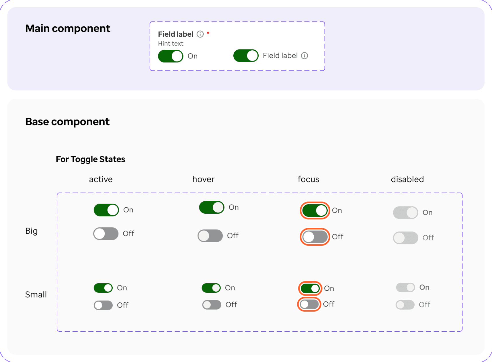
Worked alongside the broader design team to standardize 25+ core components.
I contributed several custom components like: headers, footers, toggles, filters, data viz pattern, input fields, where the Optum design system didn't cover an enterprise data need, and helped maintain the Figma library so the surface area stayed consistent as features shipped.
A user moving between Surgical Cost and adjacent Crimson AI modules now sees a coherent product, not stitched modules.


Other Design Works : 2
PCM Workflow Redesign
Less scrolling for the same information
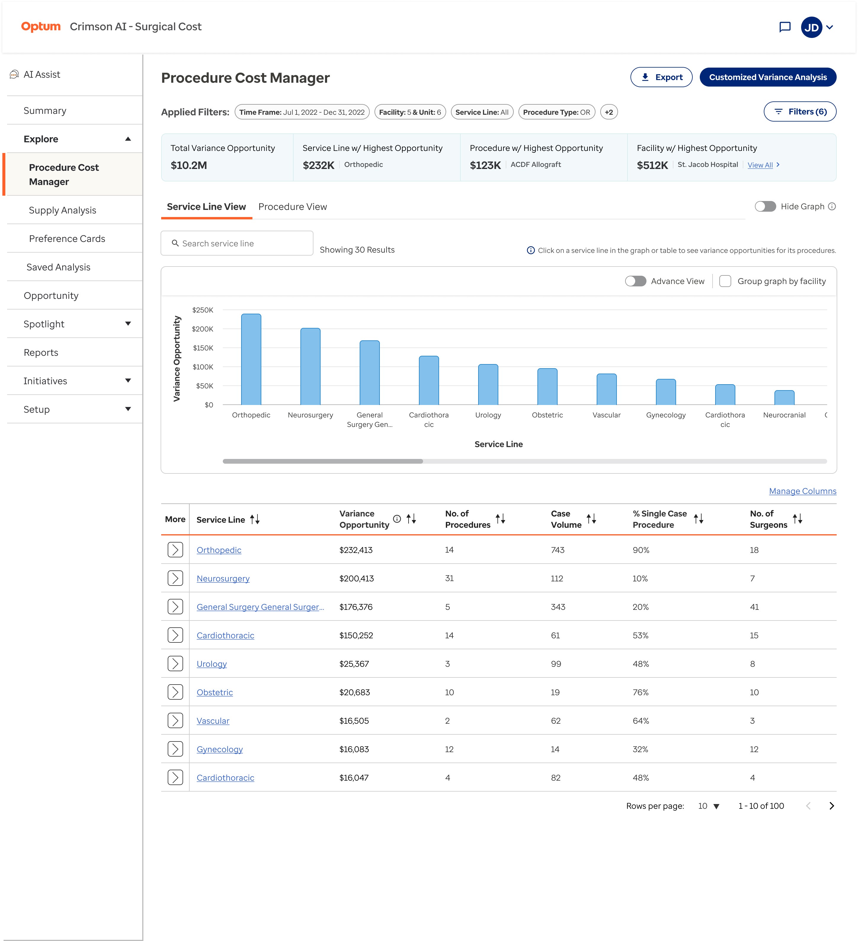
The original Procedure Cost Manager (PCM) landing forced excessive scrolling before users reached actionable content: graphs took up too much vertical space, padding was generous to a fault, and there was no way for power users to skip the visuals entirely. I redesigned the page to reduce graph heights, tighten white space, and add a hide-graph toggle so users who already know their numbers can jump straight to the table view.

Other Design Works : 3
Supply Spotlight
A 360° view of every supply in the hospital network
I co-worked with a peer designer on this concept. We did competitor evaluation, IA, dashboard ideation, and also prepared dev files. The workflow gave users a holistic view of any supply — its cases, opportunities, procedures it's used in, pricing details, and category mapping by UNSPSC or GMDN. The landing page surfaced overall trends like monthly cost spend, top UNSPSC categories, implant spend, and contracted supply spend.
Mid-project, leadership concluded the workflow wasn't a strategic differentiator since competitor products already offered comparable functionality. The team's effort was redirected to features that strengthened the product's USP.
Including this here because the dashboard design and IA stand on their own as a sample of how I approach an analytics dashboard from scratch.

Hope you loved reading the case study
IMPACT & OUTCOMES
What shipped, and what it meant
A new module designed end to end, built across 6+ months of iterative releases with PM, data methodologists, engineering, and Client Value Managers.
350+
screens and UI assets shipped across the Surgical Cost module
30+
features designed & shipped in close collaboration with PM, TPM, and Dev, shipped by May 2026
16%
reduction in supply wastage ($680K) in one year at a New York health system via Surgical Cost app
250+
frontend defects documented & resolved through dev audits with engineering team in 2025
$2.5M+
saved in surgical services at another health system, with 32 hospitals and 700 sites using Crimson AI suite
25+
UI components standardized with the Crimson AI design team. I took ownership of atleast 5 components.

Beta launched a quarter ahead of plan
Surgical Cost module beta shipped in July 2025, one quarter ahead of timeline. Enabled faster user feedback and demonstrated strong cross-functional coordination.

Enabled a major GPO partnership in Oct’25
Supported signing of business partnership with the third-largest Group Purchasing Organization in the US with a network of 1,800 hospitals, by designing a co-branded demo prototype showcasing enhanced features.
What the leaders said
"We’re ahead of schedule by a full quarter! This kind of acceleration doesn’t happen by chance, it’s the result of your incredible momentum, focus, and teamwork."
‒ Madhu Pawar, Leadership · Bravo Award, June 2025
"Thanks to the dev team for building and Lakhi & Apoorv for UX design and support. The new PCM frontend screens look way better now."
‒ Product Manager, April 2026
“Great job, Apoorv! Team was impressed with the Multi-select hierarchical dropdown mockup & explanation. Felt it's more user-friendly. They wan’t to componentize this and publish it for use in other modules too.”
‒ Santhana Krishnan, TPM · Internal feedback, April 2026
Apoorv has consistently delivered strong design outcomes across multiple projects. His work has been well‑received by project teams, particularly for the quality of his research, thoughtful problem‑solving, and the practicality of the design solutions he proposes. Across engagements, he has demonstrated reliability in delivering requested designs and solutions, along with empathy and compassion in stakeholder interactions. Apoorv regularly comes up with well‑considered design solutions that reflect solid design thinking.
‒ 2025 Year-in-Review Evaluation at Optum
My learnings
Frontend QA is a design responsibility
Making pixel-perfect designs in Figma matters less if they're not reflected in the built product. Documentation defects taught me that design ends when the built product matches the intent, not at handoff.
When users are out of reach, find the people closest to them
Without direct access to US hospitals, Client Value Managers became my proxy users. They spoke to hospitals daily and helped me validate design decisions early.
Consistency lives at the suite level, not just the module level
When multiple designers work on the same suite, inconsistencies multiply fast. Shared guidelines and daily reviews made each module feel like part of one family.
Cross-functional communication is a design skill
Most design wins came from conversations with PMs, engineers, and TPMs, not from the Figma file. Communicating UX rationale clearly mattered as much as the design itself.
Manage Measures
Most data tables in Surgical Cost have a Manage Columns control above them: open a flyout, toggle columns, drag to reorder.
Problem of Expanding
Most data tables in Surgical Cost have a Manage Columns control above them: open a flyout, toggle columns, drag to reorder.
Then the product expanded. We started pulling cross-module measures into these tables. Quality outcome measures (SSI rate, mortality rate, readmission), Profitability measures, Financial measures, all alongside the regular columns.
The flyout was no longer going to manage 10 flat columns. It will be managing 30+ measures across 6+ groups, with more coming.
First change - showing fixed primary columns
The main column or set of columns in each table should remain visible and not be reordered. They provide the essential context for the table and the data users seek. Therefore, in the management column, the first step was to ensure these columns are visible in the list of other columns, while the options to manage them, such as the checkbox and dragging icon, are disabled.
Took two design approaches
Grouped: measures nest under their parent group with an accordion header, count of selected measures, and parent checkbox with intermediate states. Reorder constrained within group.
Ungrouped: flat list, with colored category tags next to each measure name to preserve context. The main advantage of this approach is that any measure can be placed next to any other column even if it doesn’t belong to the same measure group.
I prototyped both in Figma Make with working interactions, demoed them to PMs across modules.
First feedback: Project Managers found both approach equally good
Since this was a common functionality for all the modules in Crimson AI, I discussed the feature ideation with all the PMs. They identified the key advantages and disadvantages of both approaches. The ungrouped method allows for any measure to be placed alongside any other column, regardless of its measure group. In contrast, the grouped approach offers a more intuitive and polished appearance.
From an engineering perspective, the ungrouped option is notably simpler to implement, requiring no new component patterns and enabling faster deployment.
Thus, we decided to proceed with the ungrouped approach for its feasibility.
CVM feedback shaped the search and labels
Two specific asks from CVMs:
Search should match measure group names too. Typing "outcomes" should surface the whole measure group too, not just measures with that word in their name.
Info icons for certain columns should carry into the flyout as well like we have in the table. Some abbreviations (like "ASC-3") aren't obvious.
Second Feedback: Leadership found problems in the ungrouped approach
Leadership reviewed and pushed back on three things:
Category context was lost on the table. Colored tags worked inside the flyout but not on the table itself, so a user couldn't tell which group a measure belonged to while scanning.
The flat list wouldn't scale. With more measure groups coming, the ungrouped list would become a long unstructured scroll.
Group-level quick-select was missing. Most users want either all measures from a group or a curated subset. Forcing them to expand-and-tick every time was unnecessary friction.
Leadership also flagged the name. Manage Columns wasn't right anymore. Renamed to Manage Measures.
Landed back on the grouped approach
I went back to the grouped layout and incorporated the features requested by leadership.
Retained the ‘quick-select checkboxes’ as it was in the grouped approach.
Renamed the control on the table from ‘Manage Columns’ to ‘Manage Measures’ for clarity, and the
Incorporated search and info icons enhancements, as requested by CVMs, in the designs.